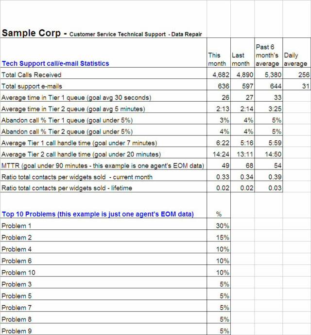
Example - Data Repair Dashboard. This is a snapshot of the current month, previous month, and 6-month trend covering all of the major area that need to be measured within Data Repair. This is the kind of quick status report you would bring to an upper management meeting. You want to easily be able to show whether you are hitting your goals, or if there are any noticeable trends. From this example you can see that the goals are being obtained by comparing not only this months worth of data, but by also comparing it to last months and trending over the past 6 months. The top problem reported, which we are just generically calling Problem 1, represents 30% of all cases opened. This could be a serious problem and should be investigated. The data on this report is pulled from data within other areas on the same spreadsheet:
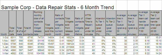
Example - Data Repair Stats. This screenshot comes from the same spreadsheet as described in the previous example. It shows the past 6 months worth of total calls, e-mails, ratio of total contacts per widget sold each month and lifetime, MTTR, abandon call %, average time in queue, and average call handle time in both the Tier 1 and Tier 2 queue's. The charts that follow are pulled from this data to quickly spot any trends:
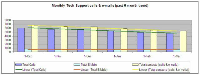
Example line chart - calls and e-mails received. You can see from the chart below that trend line is showing that both calls and e-mails to Data Repair are decreasing. This can suggest a few things such as less repeat calls, better product stability, and customers troubleshooting more themselves through the posted FAQ's. This trend can help you determine whether total contacts in the past 6 months are increasing or decreasing. If you have your department structured to its optimum and yet calls are increasing, you might need to hire more technicians. This is the kind of data that would support that decision:
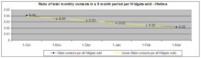
Example line chart - Ratio of contacts per Widgets sold - lifetime. This report follows the same format as the example just described, however, this is tracking data based on all of the Widgets sold lifetime:
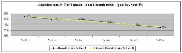
Example line chart - Abandon rate in the Data Repair Tier 1 queue. Part of increasing customer satisfaction is to reduce time in queue. When people hang up before an agent picks up the phone, satisfaction levels go down. In this case you can see that the goals have been met for the past 3 months, and that trending is showing the abandon call % is continually going down, which is a great thing:
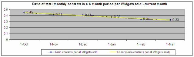
Example line chart - Ratio of contacts per Widgets sold - current month. You can trend problems with the product based on the amount of calls and e-mails received versus the amount of sales. From this example, the amount of contacts per widget sold each month is trending downward, which is a good sign. This can also tell us that there might be less repeat calls, which would show that your support team is doing a good job on First Call Resolution's (you could determine if this was true by pulling repeated customer problem reports):
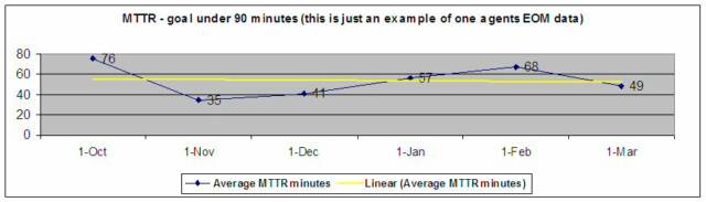
Example line chart - MTTR (Mean Time To Repair) - one agent. This chart shows the average time it takes to open and close a case. This particular example is based on the cases worked on the last day of the month by just one technician. You can trend agent performance in this type of format:
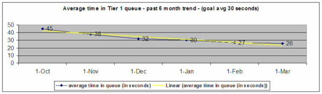
Example line chart - Average time in the Data Repair Tier 1 queue. This chart shows the average time in queue. Again, part of increasing customer satisfaction is to reduce time in queue. When people are on hold for a long time before an agent picks up the phone, satisfaction levels go down. In this case you can see that the goals have been met for the past 3 months, and that trending is showing the average time in queue is going down. Trending here also correlates to the previous example and proves that lower queue times results in lower abandon percentages:
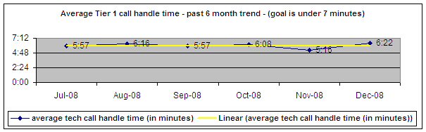
Example line chart - Average time spent on each call - Tier 1. Through analysis, it was determined that an average of 7 minutes per call was determined in order to keep the hold time at a sufficient level. In this case, you can see that the goals have been met and that trending is showing the average time spent on calls is steady and looks good. One thing to keep in mind, never sacrifice a positive customer experience with trying to limit the time spent on calls. This is an average, and there will be some calls that will last 15 to 20 minutes, and some that are only 30 seconds long. This is a crucial fine balance:
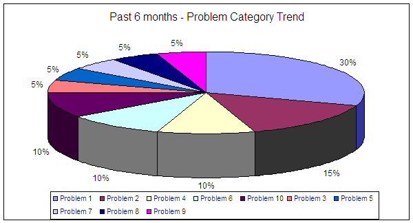
Example pie chart - Trending the most common problems found. This is an useful tool to find a common problem based on the proper use of codes in the ticketing system. With detailed analysis like this, you can investigate as to why and what is causing the problem. This kind of data helps engineers to find a root cause. Poor data would be stating, “It doesn't work." Good data would state something like, "Widget reboots when latest code is loaded." In this example, the generically named "Problem 1" contributes to 30% of all cases opened. That is one you would want to investigate as soon as possible:
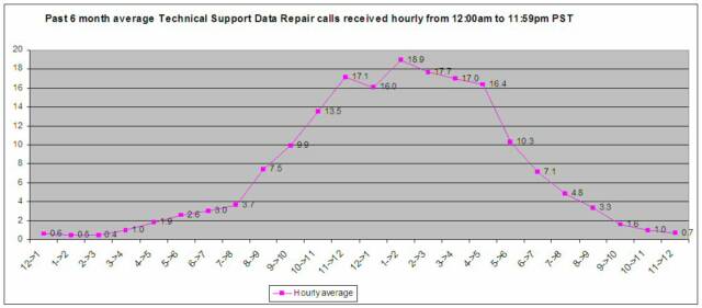
Example - Average hourly call volume in the past 6 months. This line chart shows the average amount of calls received hourly in a 24-hour period for the past 6 months. It starts at 12:00am and is used to track the busiest hours of the day in order to best determine when to staff and to strategically manage lunch and break times:
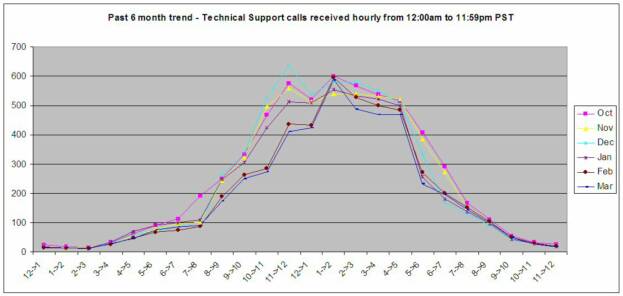
Example - Average hourly call volume in each of the past 6 months. This data is based on the previous chart but shows individual monthly detail on each of the past six months. With this data you can see if there are any particular monthly trends such as common peaks and drops:
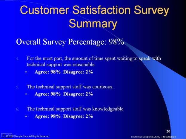
Example - Data Repair Customer Satisfaction Survey summary. Though customer surveys, you can determine the satisfaction levels and areas where you can improve. The goal of 95% or greater was achieved due to the planning and structural changes made by developing a tiered system. The screenshot below is from one of the last pages of the PowerPoint presentation:
The text of these materials, or any part thereof, may not be reproduced or transmitted in any form or by any means, electronic or mechanical, including photocopying, recording, storing in an informational retrieval system or otherwise, except for students own personal use. The author does specifically disclaim any responsibility for any liability, loss, or risk, personal or otherwise, which is incurred as a consequence, directly or indirectly, of the use and application of any of the contents of this course.
Step 10 - Monitor and control it all to keep it running smoothly
Now that you have the department in order, everyone is trained and happy, and you have all of your processes and procedures in place, the best way to determine how things are going is through reports and feedback.
Continuous employee feedback and communication, statistical reporting, customer based surveys, feedback from suppliers, feedback from other departments that are closely involved with yours, sales performance, financial analysis, inventory control, monitoring order accuracy, and employee evaluations are just a few of the necessary tools to monitor how your department is performing.
There might be problems and unforeseen bumps in the road ahead such as a new product line or taking on additional responsibilities, however, with all of the planning and organization you have put into place, you will just need to do some slight modifications to keep it all running smoothly.
Although the following charts are simple and dated, they still hold true to the basic data gathering principles.
Here are just a few examples of the types of statistical reporting you can use as a guide for tracking goals and looking for trends. The screenshots that follow were pulled from spreadsheets. For simplicity, we are focusing on Data Repair from the customer service example (you would want to keep Voice Repair separate anyways as they have different metrics to report).
LESSON 2 - HOW TO MANAGE AND ORGANIZE YOUR DEPARTMENT TO MEET THE GOALS
Double click the icon to download this file
Once the file is open, you can save it like you would any other file.
Double click the icon to download this file
Once the file is open, you can save it like you would any other file.
You need to have the right toolsto measure productivity and process effectiveness. At a minimum, you need to know how to read, create and manipulate a spreadsheet, know how to create and present a PowerPoint presentation, and work with a Word Processing doc. Other great tools are Visio for creating flow charts, and Microsoft Project for large task related projects.
Being able to analyze the data not only helps you find trends, it also keeps upper management informed. They can either see the progress you are making or the problems you are having. Either way, they will appreciate the fact that they are not being kept in the dark.
If any problems arise when monitoring productivity, make sure you have created a systematic approach in finding the root cause and correct resolution. In order to do this, you need to have accurate data as previously presented. You would then set up a meeting with key players in your department, and if necessary, key players from other departments. The key point here is to make sure you have the accurate data to back up the issues at hand.
For example, if your team is getting inundated with calls due to a faulty product complaint, you need to have a system in place that tracks by problem report code, category, and resolution along with accurate documentation. This is needed to help spot the trend. With accurate data you can report something like “an 18% increase in customer complaints due to a power failure.” This is much better than making a generic statement like, “Customers are complaining that the product doesn’t work.”
With this type of information, you can present the data with confidence to the other areas within the company. With this accurate data, they should be able to find the source of the issue. You need to be exact, precise, timely, and confident with the data you provide. Don’t come off like you don’t know what you are doing. You will not be taken seriously, the customers will continue to be upset, future sales will go down, and the department morale will decline due to the increase in work and complaints. All of this because of insufficient data.
Do not be afraid or intimidated to bring issues up to other department heads. This is expected of you. As the manager of your department it is your job to make sure everything is running smoothly, including issues that might be out of your control. At the same time you need to be careful that you do not look like you’re on a witch-hunt to find the culprits. It’s all about finding the perfect balance between being easy going and aggressive. You need to make sure that you, and the other departments involved, understand that this is for the greater good of the company’s success. Your part is just to make sure it is clear you are doing everything you can to achieve the company’s goals.
Utilizing all that has been taught in this lessonwill help build your value and effectiveness as a manager. A department that is structured to achieve its goals is key to being a successful manager. Following through on your well thought out plans will show off your management and leadership skills, it will also earn you a great deal of respect.